.png)
CONTRIBUTION
Design System, Testing, Comp Analysis
TIMELINE
2 Weeks
TEAM
1 of 3 UX Designers
PROBLEM
Users need a way to keep track and manage their subscriptions because they feel frustrated, forgetful, and financially strained when managing multiple subscriptions.
OUTPUT
, a 15-screen high fidelity prototype mobile application that minimizes the time spent finding and cancelling subscriptions and eases financial strain.

The subscription industry is set to reach $1.5 trillion by 2025, yet 42% of participants in a study stated they forgot they were being charged for a subscription they no longer used.

INTERVIEWS
.png)
COMP ANALYSIS
Our top competitors do not prioritize subscription features for users.
Users have to go through 4 layers of navigation to find and manage their subscriptions with our largest competitor, Mint.
I created this sitemap of Mint to effective demonstrate to stakeholders the significant market potential for our MVP. We prioritize subscription features for our users, making it a primary focus rather than an afterthought.

Our top competitors do allow users to link their bank accounts to the app.
Linking bank account and credit cards allows the app to auto locate subscriptions from the users transaction history.
I created a feature inventory of our competitors to identify the baseline features our MVP needs to compete in the market. To make it easier for users, we wanted to allow people to link their banking information to auto populate their subscriptions.


MID-FI WIREFLOWS
Our user goal is to manage subscriptions easily, so I designed a flow as short as possible to get from onboarding, to cancelling unused subscriptions.
1. During onboarding, a primary CTA leads users to link a bank account.
2. During onboarding, a secondary CTA leads to the dashboard, which users can click on the primary nav bar.
3. During onboarding, a secondary CTA leads to the subscription page, which users can click on the primary nav bar OR "Due Soon" component.

USABILITY TESTING - ITERATIONS
Only 60% of users found completing tasks "easy."
Based on user feedback, I synthesized data into a report and found three main areas of focus for our iterations.
1. PRIVACY & SAFETY CONCERNS
2. LIMITED TO 1 BANK ACCOUNT
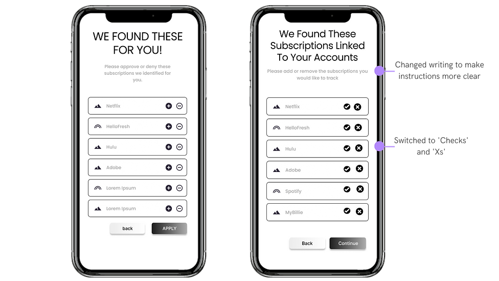
3. CONFUSING UX WRITING
.png)
.png)

BRANDING
I created a design system!
*For this project I was responsible for grayscale framework only, but I still wanted to create my own style guide for my vision of where I saw our MVP going.

THE FINAL PROTOTYPE


CONCLUSION + FINAL THOUGHTS
This was my first group project working with a team of UX Designers, and there’s one thing I would do differently next time:
1. Be open to any role.
This project taught me an important lesson about being a UX designer. Initially, I stuck to my comfort zone of visual design and prototyping, while my colleagues pushed their boundaries. However, halfway through, I felt guilty and decided to step out of my comfort zone by conducting usability tests and engaging with our target audience.
It was in that moment I realized that being a skilled UX designer isn't just about creating visually appealing designs, but also about gaining experience through user interaction, data synthesis, and real-world testing. This project taught me the importance of being open to different roles to become a well-rounded UX designer.
